Double Page Spread Research
- Kiara Casabuena
- Feb 7, 2025
- 4 min read

Updated: Apr 15, 2025
In this blog post I am analyzing two magazines of my genre which in this case in food and beverage. A double-page spread is when two pages are shown together, often with a big picture and an article or advertisement beside it. I look at how things like layout, fonts, and colors are used to grab the reader’s attention and share information.
MAGAZINE #1: My Kitchen TABLE OF CONTENTS


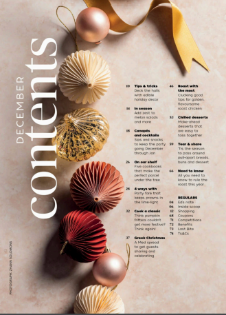
DOUBLE PAGE SPREAD


CONTENT:
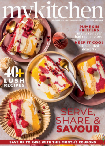
This magazine above is from My Kitchen and the article name being "Melon Season". This magazine would be for anyone since its recipes for drinks and easy salads to create. Since it includes the ingredients, measurements, and decorations to create these drinks and salads. To get the perfect drink or salad it's better to follow the steps and get the right ingredients to make a good piece of food.
HOUSE STYLE:
The magazine has mostly colorful colors like red, yellow, green, and pink giving it a feeling of summer. This magazine also has one picture of each page and shows drinks and food displayed in a organized way with utensils, cups, wine glasses, and food plates and bowls. The magazine has a combination of sans serif and serif font.
NUMBER OF IMAGES: 4
NUMBER OF TOTAL PAGES IN THE ARTICLE: 4
DESCRIPTION OF EACH IMAGE:
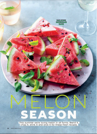
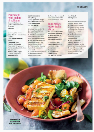
FIRST PAGE: It shows one image covering the whole first page of the magazine with bright red watermelons with green leaf's around it. Around the plate there is an orange transparent cup with a leaf on top and a clear wine glass.
SECOND PAGE: There's only one image covering the page and in the image you can see a salad filled with different ingredients like chicken, tomatoes, onions, etc. with nice dressing on top. The salad is on this nice red bowl with a fork in the salad.
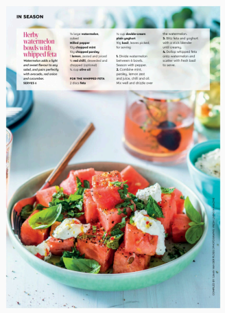
THIRD PAGE: One image of cut up watermelons with cilantro and white cream on top. In the back of the image we can see a cup with a pink drink and a blue bowl with rice.
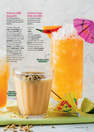
FOURTH PAGE: This image shows a melon & chill's drink with ice filled to the top and a umbrella on top. The theme for this picture is orange cause everything is orange. Right next to the drink there is a smaller cup with a melon & stone smoothie and on top there is granola pieces in the drink and on the table. The drinks are placed on a green napkin with a yellow umbrella for drinks and a lime.
HEADLINE:
The headline is "Melon Season" in sans serif font with the word melon is lime green and season is plain white. The word MELON is what grabs your attention the most since its in all caps and its in a bright color.
SECTION TITLE:
Panzanella with melon & halloumi
Rum-spiked watermelon slices
Herby watermelon bowls with whipped feta
Melon & Chilli margarita
Melon & stone fruit smoothie
PULL QUOTES:
This article doesn't have pull quotes
ARTICLE FONT FORMAT:
This article has a combination of sans serif and serif fonts. The headings and title big in bold while the rest of the wording is in normal lettering.
STYLISTIC FEATURES:
This article has the same color pallet throughout the whole article like warm colorful colors like red, green, yellow, and orange. The text uses the color white, black, and pink. All of the pages only use one image to cover the whole page all having multiple colors involved.
NUMBER OF COLUMNS PER PAGE:
Each page has around 2-5 columns per page.
MAGAZINE #2: My Kitchen TABLE OF CONTENTS


DOUBLE PAGE SPREAD


CONTENT:
This article is for mostly for adults or chefs that want to cook something different and unique.
Since it includes the ingredients, measurements, time and temperatures to create different types of foods and sandwiches.
HOUSE STYLE:
This article mostly has one picture for each page but with different plates and foods like the foods plate, cups, and napkins. The magazine mostly has a red and brown color palette with a mix of orange and blue. All the words in the magazine have a sans serif font, all being aligned in organized columns.
NUMBER OF IMAGES: 3
NUMBER OF TOTAL PAGES IN THE ARTICLE: 4
DESCRIPTION OF EACH IMAGE:
FIRST PAGE: The first page of the magazine is one image which covers the whole page of a very tasty sandwich with stretchy cheese and dripping sauce on top.
SECOND PAGE: There is multiple different types of sandwiches with different types of breads. One sandwich has light bread with tomatoes and ham inside. Another sandwich is a little burnt with tomatoes and cheese. The last sandwich has brown bread with pepper, avocado and red pepper.
THIRD PAGE: This image shows two sandwiches, one with turkey and a type of sauce on the side. The other sandwich has meat and we also see on the side in the blue cup with some type of meat in it. The sandwich is placed on a red plate with a red table cloth underneath it.
HEADLINE:
The headline is "make it crrrisp!" in sans serif font with the color of white and blue. The word CRRRISP is what grabs your attention the most since it's in all caps and the word crisp has three r's which is different and can grab anyone's attention.
SECTION TITLE:
The Leftover
The veg with vooma
The easy Brie-zy
The hot chook
Quick tamarind date chutney
PULL QUOTES:
This article has no pull quotes
ARTICLE FONT FORMAT:
All the wording in this article is sans serif but also mixed with serif font. The headings is big in bold while the rest of the wording is in small letters.
STYLISTIC FEATURES:
This article has the same color pallet of brown and red coloring. The text uses the color white and all of it being in san serif with a mixed of serif. All the pages include one image to cover the whole page but each image has different types of sandwiches.
NUMBER OF COLUMNS PER PAGE:
Each page has between 1-3 columns per page.


Comments