Magazine Cover Research
- Kiara Casabuena
- Dec 6, 2024
- 2 min read

Updated: Apr 15, 2025
For this project, we are comparing magazine covers from my chosen genres, which are sport and food genres, focusing on their codes and conventions and graphic elements. I will be analyzing these covers to see what they have in common and what makes them unique and different from each and the same.
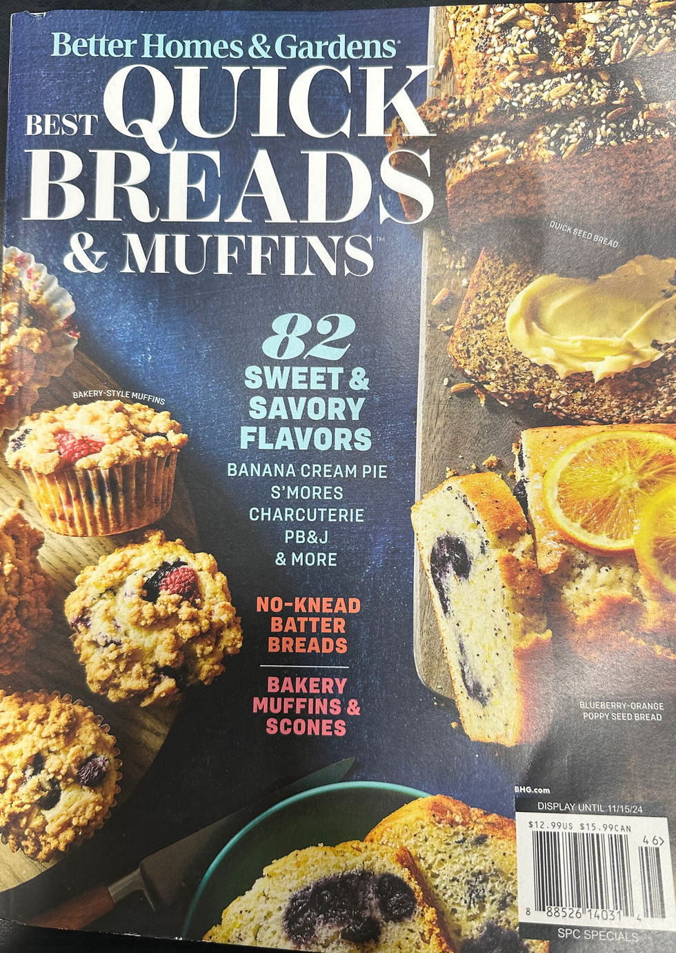

Here we have my first genre which is food and drinks. Starting off with their similarities we can see that both covers are about bread and a different type of bread too. Also both magazine have a neutral color which many colorful fruits that are eye catching. They both have MASTHEADS in the color white, but we can see as one of their differences the fonts are not all in caps like the first magazine. Both magazines have a SKYLINE and they both have the same thing which is "Better Homes&Gardens" but they are in a different color. They both have a BARCODE at the bottom right. They both have their CENTRAL
IMAGE that are both very delicious looking but the second magazine has more of a regular tasting bread and the first one has sweeter bread. The second magazine has a PUFF which states "72 recipes from easy to artisan" but the first one doesn't.

The second genre is sport. First some similarities I notice is both magazine covers are about the sport basketball. The COLOR SCHEME for both magazine are filled with red, white, and yellow. Both magazine have MASTHEADS in different colors. The first magazine has it in white and the second magazine has it in black. We also see that the first magazine the masthead is in all caps and the second one isn't. Another difference between the two is the second magazine has a SKYLINE. Both magazine have a BARCODE located at the bottom left. Both magazine have a CENTRAL IMAGE but the first magazine central image is more intense since its Michael Jordan shooting

a goal while in the air. This may seem more eye catching to the audience. The first magazine has a PUFF that states
"40 years an icon".


Comments